menu
書いてる野郎
orebike@gmail.com
結論から言うとほぼ
<span>★</span>
が挿入されているのと同等でなんでもできる。
サンプルのHTML
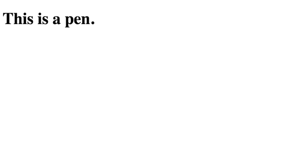
<h1 id="hogehogehoge">This is a pen</h1>
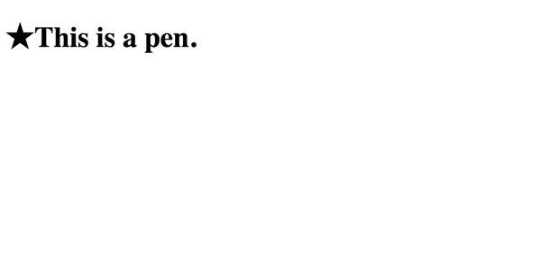
まず単純に文字を挿入する。そうすると、普通に「This is a pen」の前に「★」が挿入される。
#hogehogehoge::before{
    content: "★";
}
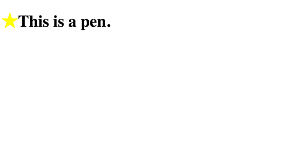
色をつけてみる。普通に色がついた。
#hogehogehoge::before{
    content: "★";
    color: yellow;
}
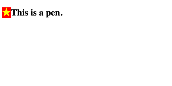
では背景を設定してみる。普通に色がついた。ベトナムである。
#hogehogehoge::before{
    content: "★";
    color: yellow;
    background-color: red;
}
では線を引いてみる。普通についた。
#hogehogehoge::before{
    content: "★";
    color: yellow;
    background-color: red;
    border: 1px solid black;
}
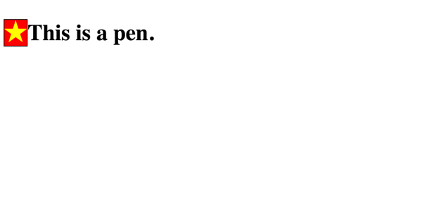
フォントをでかくする。普通にでかくなった。
#hogehogehoge::before{
    content: "★";
    color: yellow;
    background-color: red;
    border: 1px solid black;
    font-size: 50px;
}
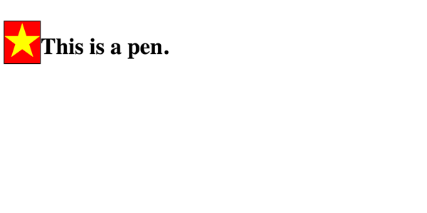
余白をつけてみる。普通にできた。
#hogehogehoge::before{
    content: "★";
    color: yellow;
    background-color: red;
    border: 1px solid black;
    font-size: 50px;
    padding: 10px;
}
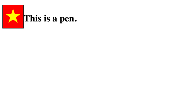
文字との間隔をあけてみる
#hogehogehoge::before{
    content: "★";
    color: red;
    background-color: green;
    border: 1px solid #f00;
    font-size: 50px;
    padding: 10px;
    margin-right: 20px;
}
普通に空いた。
角丸にしてみる
#hogehogehoge::before{
    content: "★";
    color: red;
    background-color: green;
    border: 1px solid #f00;
    font-size: 50px;
    padding: 10px;
    margin-right: 20px;
    border-radius: 6px;
}
普通になった。
デカさ指定してみる
#hogehogehoge::before{
    content: "★";
    color: red;
    background-color: green;
    border: 1px solid #f00;
    font-size: 50px;
    padding: 10px;
    margin-right: 20px;
    border-radius: 6px;
    display: inline-block;
    width: 100px;
    height: 50px;
}
普通にできた。
好きな位置においてみる
#hogehogehoge::before{
    content: "★";
    color: red;
    background-color: green;
    border: 1px solid #f00;
    font-size: 50px;
    padding: 10px;
    margin-right: 20px;
    border-radius: 6px;
    display: inline-block;
    width: 100px;
    height: 50px;
    position: absolute;
    top: 40px;
    left: 300px;
}
普通に動いた
相対位置になる?
#hogehogehoge{
    position: relative;
}
#hogehogehoge::before{
    content: "★";
    color: red;
    background-color: green;
    border: 1px solid #f00;
    font-size: 50px;
    padding: 10px;
    margin-right: 20px;
    border-radius: 6px;
    display: inline-block;
    width: 100px;
    height: 50px;
    position: absolute;
    top: 40px;
    left: 300px;
}
普通にh1 に対して相対位置になった。スゴイ。
相対位置で微調整できる?
#hogehogehoge::before{
    content: "★";
    color: red;
    background-color: green;
    border: 1px solid #f00;
    font-size: 50px;
    padding: 10px;
    margin-right: 20px;
    border-radius: 6px;
    display: inline-block;
    width: 100px;
    height: 50px;
    position: relative;
    top: 20px;
}
できる。スゴイ。